
After hours brand identity & packaging
After Hours is built around a single principle:
performance requires a deliberate transition into recovery. The brand does not promote sleep as escape, but as a controlled descent - a necessary phase in sustained high performance.

Signature brand identity creation
Strategic brand identity and packaging designs
5-7 weeks
Concept
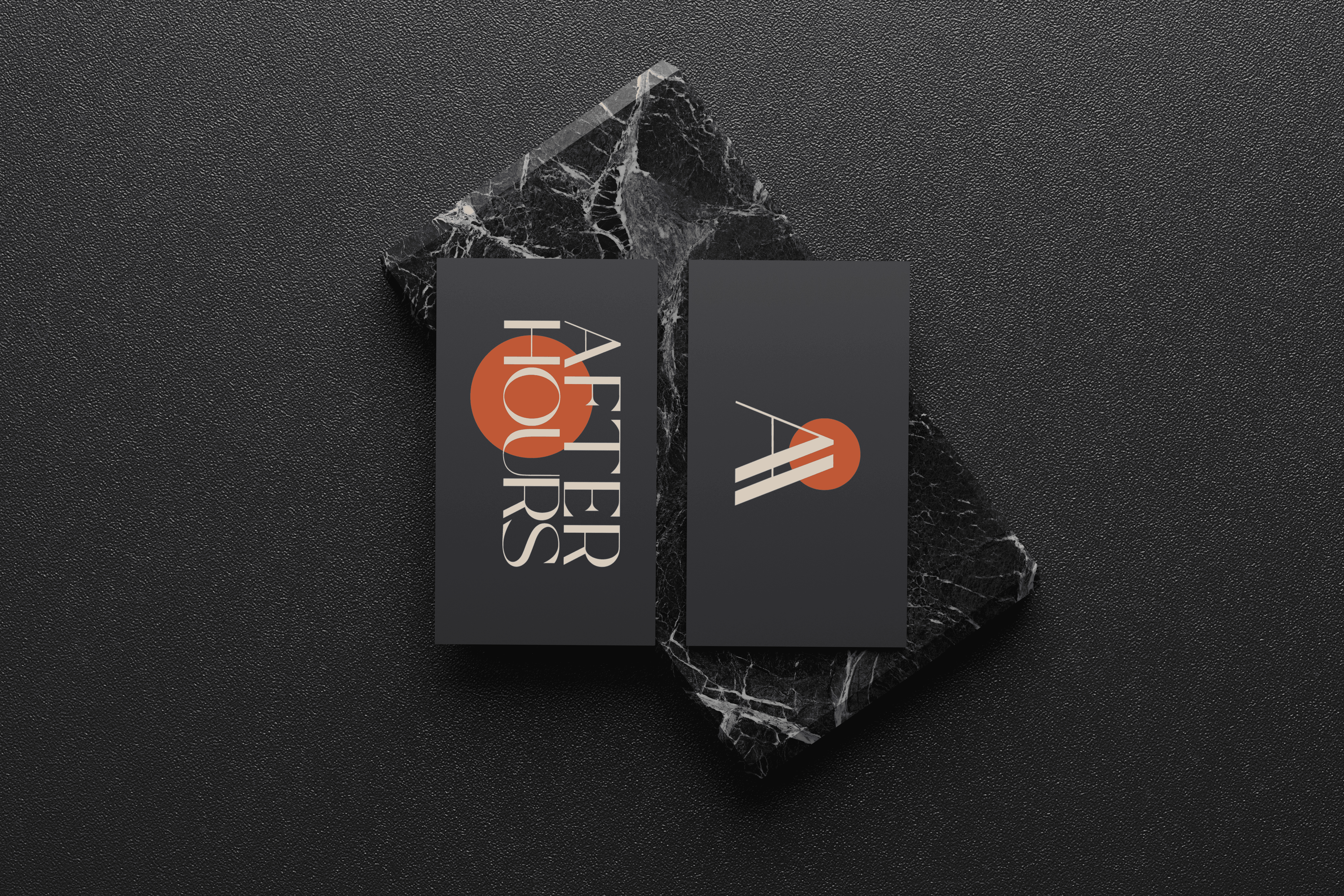
Where performance-driven products often rely on intensity and busy visuals, After Hours moves in the opposite direction to support the function of the product: slowing down, clearing the mind, regulating the nervous system. Brand design leans on minimalism to create a slower visual rhythm, using minimal composition and generous negative space.
Strategic design
The color palette reinforces this brand philosophy. A smoky, deep blue anchors the identity, representing ascending night and the transition out of cognitive intensity.


Symbolism
Conclusion
Not everything is built through intensity.
Some things require stillness.

